UI rendering, lists, input, and accessibility
Learn how Views and Compose measure and draw UI, how lists preserve identity, and how to build controls every user can operate.
Android has two major UI toolkits: the View system and Jetpack Compose. Interviews may focus on one, but strong developers understand the shared constraints underneath both: a finite window, measurement, placement, drawing, input, semantics, and state.
Learning goals
- Describe measurement, layout, and drawing in both UI toolkits.
- Build efficient lists with stable item identity.
- Explain why modifier and listener order changes behavior.
- Handle text input, focus, and the on-screen keyboard.
- Test accessibility semantics, touch targets, and large-text layouts.
The frame pipeline
The main thread handles input, executes UI work, and submits frames. Work that misses the device’s frame deadline appears as jank. A 60 Hz display has about 16.7 ms per frame, while higher refresh rates provide less time.
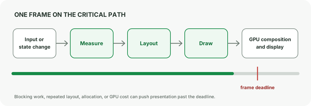
Do not turn the frame budget into a claim that every method must finish within 16 ms. The relevant question is whether the total critical work needed for a frame finishes before its deadline.
View system: measure, layout, draw
The View hierarchy generally moves through three stages:
- Measure: parents pass
MeasureSpecconstraints; children report measured dimensions. - Layout: parents assign final positions to children.
- Draw: Views draw backgrounds, content, children, and decorations.
Calling requestLayout() can schedule measurement and layout. Calling invalidate() schedules drawing without necessarily remeasuring.
A custom View should respect the sizes allowed by its parent:
override fun onMeasure(widthSpec: Int, heightSpec: Int) {
    val desiredWidth = suggestedMinimumWidth + paddingLeft + paddingRight
    val desiredHeight = suggestedMinimumHeight + paddingTop + paddingBottom

    setMeasuredDimension(
        resolveSize(desiredWidth, widthSpec),
        resolveSize(desiredHeight, heightSpec),
    )
}
Avoid deep, redundant nesting and expensive work inside onDraw() or list binding. Precompute immutable display values when practical.
Compose: constraints go down, size goes up
Compose follows the same essential contract with a declarative API:
- A parent measures a child with constraints.
- The child chooses a size within those constraints.
- The parent places the child.
- Drawing happens after layout.
Most Compose layouts measure each child once. Custom layouts should not casually remeasure a child because the runtime enforces the measurement contract.
@Composable
fun ProfileRow(user: UserUi, onClick: () -> Unit) {
    Row(
        modifier = Modifier
            .fillMaxWidth()
            .clickable(onClick = onClick)
            .padding(horizontal = 16.dp, vertical = 12.dp),
        verticalAlignment = Alignment.CenterVertically,
    ) {
        Avatar(user.avatarUrl, contentDescription = null)
        Spacer(Modifier.width(12.dp))
        Text(user.displayName, style = MaterialTheme.typography.titleMedium)
    }
}
Modifier order is part of behavior
Compose modifiers wrap the element from left to right. Order changes hit area, padding, clipping, background, and semantics.
// Padding is inside the clickable region.
Modifier.clickable(onClick).padding(16.dp)

// Padding surrounds a smaller clickable region.
Modifier.padding(16.dp).clickable(onClick)
When debugging a modifier chain, read it as nested wrappers. Ask which wrapper receives input, which owns size, and which draws first.
Lists need stable identity
RecyclerView
RecyclerView reuses item Views instead of creating one for every row. Its important responsibilities are:
Adaptercreates and binds ViewHolders.LayoutManagerpositions items.RecyclerView.ViewHolderholds item View references.DiffUtilcomputes changes between old and new immutable lists.
class UserDiff : DiffUtil.ItemCallback<UserUi>() {
    override fun areItemsTheSame(old: UserUi, new: UserUi) = old.id == new.id
    override fun areContentsTheSame(old: UserUi, new: UserUi) = old == new
}
areItemsTheSame() compares identity. areContentsTheSame() compares rendered content. Returning true incorrectly can leave stale pixels because RecyclerView believes no rebind is required.
Reset every property that binding can change. A recycled ViewHolder remembers its previous visual state.
fun bind(item: UserUi) = with(binding) {
    name.text = item.name
    verifiedIcon.isVisible = item.isVerified
    root.isEnabled = item.isEnabled
    root.alpha = if (item.isEnabled) 1f else 0.55f
}
Lazy lists in Compose
Compose also needs identity to keep remembered state and item animations attached to the right item:
LazyColumn {
    items(
        items = users,
        key = { user -> user.id },
        contentType = { "user" },
    ) { user ->
        UserRow(user)
    }
}
Use a stable, unique ID from the data. The item index is not stable when insertion, removal, or reordering can occur.
State belongs above reusable UI
A reusable field should receive current value and emit user intent:
@Composable
fun EmailField(
    value: String,
    error: String?,
    onValueChange: (String) -> Unit,
) {
    OutlinedTextField(
        value = value,
        onValueChange = onValueChange,
        isError = error != null,
        supportingText = { if (error != null) Text(error) },
        label = { Text("Email") },
        keyboardOptions = KeyboardOptions(keyboardType = KeyboardType.Email),
        singleLine = true,
    )
}
Hoisting state makes previews and tests easy. Local state is still appropriate for details owned entirely by the component, such as whether a tooltip is open.
Focus and the IME
The on-screen keyboard changes the usable window. Design for it rather than assuming it overlays content harmlessly.
- Use appropriate input types and IME actions.
- Move focus intentionally between fields.
- Apply window insets to scrolling content.
- Keep the focused field and primary action reachable.
- Do not clear focus on every recomposition.
val focusManager = LocalFocusManager.current

OutlinedTextField(
    value = password,
    onValueChange = onPasswordChange,
    keyboardOptions = KeyboardOptions(imeAction = ImeAction.Done),
    keyboardActions = KeyboardActions(
        onDone = {
            focusManager.clearFocus()
            onSubmit()
        },
    ),
)
For edge-to-edge layouts, use the relevant inset APIs such as imePadding() or WindowInsets consumption based on where the content should move. Avoid applying the same inset at multiple levels.
Accessibility is a functional requirement
Accessibility is not a final polish pass. A control is incomplete if a user cannot discover, understand, focus, or activate it.
Names and roles
- Give meaningful images a content description.
- Use
nullfor purely decorative images so they are not announced. - Use semantic controls such as
Button,Checkbox, andSwitchwhen they match behavior. - When building a custom control, expose role, state, action, and label through semantics.
IconButton(onClick = onFavorite) {
    Icon(
        imageVector = if (favorite) Icons.Filled.Favorite else Icons.Outlined.FavoriteBorder,
        contentDescription = if (favorite) "Remove from favorites" else "Add to favorites",
    )
}
Touch targets and contrast
Interactive targets should normally be at least 48dp by 48dp even when the visible icon is smaller. Do not encode state using color alone. Focus, selected, disabled, error, and completed states need distinct visual and semantic signals.
Large text and screen readers
Test with:
- Font scale at 200 percent.
- Display size changes.
- TalkBack traversal.
- Switch Access or keyboard navigation where relevant.
- Light and dark themes.
- Narrow and wide windows.
Fixed-height text containers often clip at large font scale. Prefer minimum height plus flexible content.
Views and Compose interoperability
Many production apps use both toolkits:
ComposeViewhosts Compose in a View hierarchy.AndroidViewhosts a View inside Compose.- Choose a
ViewCompositionStrategythat disposes the composition at the correct lifecycle boundary.
When hosting Compose in a Fragment View, disposal must align with the Fragment’s view lifecycle, not only the Fragment instance.
Common pitfalls
- Doing image decode, formatting, or database work during list binding.
- Using list position as identity when items can move.
- Forgetting to reset recycled View properties.
- Assuming modifier order is cosmetic.
- Using clickable
BoxorViewwithout a role, name, or sufficient target size. - Hard-coding heights around one font size.
- Applying status-bar or IME insets twice.
How interviewers probe this
- “Explain measure, layout, and draw.”
- “
requestLayout()vsinvalidate()?” - “How does RecyclerView recycling cause stale UI?”
- “Why do LazyColumn keys matter?”
- “What changes when
paddingcomes beforeclickable?” - “How would you make a custom control accessible?”
- “How do you keep a form usable when the keyboard opens?”
Practice checklist
- Build the same list row once with Views and once with Compose.
- Insert an item at the top and verify remembered state follows the correct ID.
- Test a form with large text, TalkBack, and the keyboard visible.
- Inspect Layout Inspector or Compose Layout Inspector for unexpected nesting.
- Write a semantics assertion for a selected and disabled control.
What you should be able to explain
- UI constraints, measurement, layout, and drawing.
- RecyclerView recycling and Compose item identity.
- Modifier order and input behavior.
- Accessibility as observable control behavior.
Next: storage, networking, and permissions, where the screen begins to depend on data and device capabilities.
Discussion
Comments are powered by GitHub Discussions. Sign in with GitHub to join in.